Menus & Navigation
There are 2 menu locations in Twenty Sixteen: top navigation & social links.
Top Navigation
The main navigation is exactly where you’d expect it: at the top of every page. Links are either right-aligned and placed to the right of the site title, or if many links are added, below the site title. It includes support for multi-level dropdown menus, at least 3 levels deep (it might go deeper, but I only tested up to 3).
On smaller devices, it transforms into a collapsible menu that expands on tap. All links are still accessible, even ones 3 levels deep.
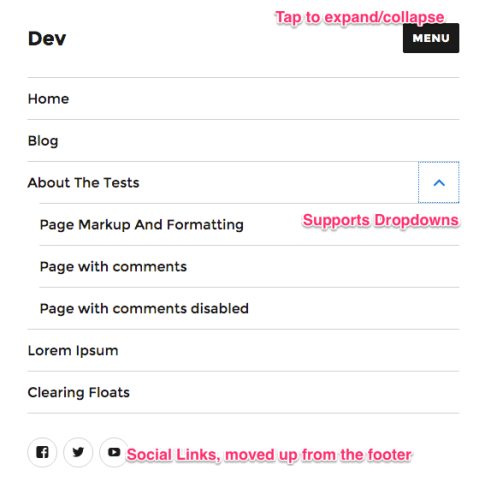
Social Links
There’s an additional menu for social media links, which, on larger screens, appears in the footer. For smaller screens that are using the collapsible, responsive menu, the social links are placed within the responsive menu, just below the main navigation links.
The Main Sidebar
Twenty Sixteen’s main sidebar is displayed to the right of the content. There are no options to change it’s location within the Customizer. There are also no additional page templates to use for static pages. They all take on the same look.
If no widgets are added to this sidebar, the space is removed, and appears as a full-width page.
Twenty Sixteen’s Content
I appreciate the abundance of white space used throughout the main content area of posts & pages in Twenty Sixteen, in addition to the well-thought-out shifting of various content areas based on the user’s screen size. It’s quite clear they took a mobile-first approach. Let’s breakdown each section:

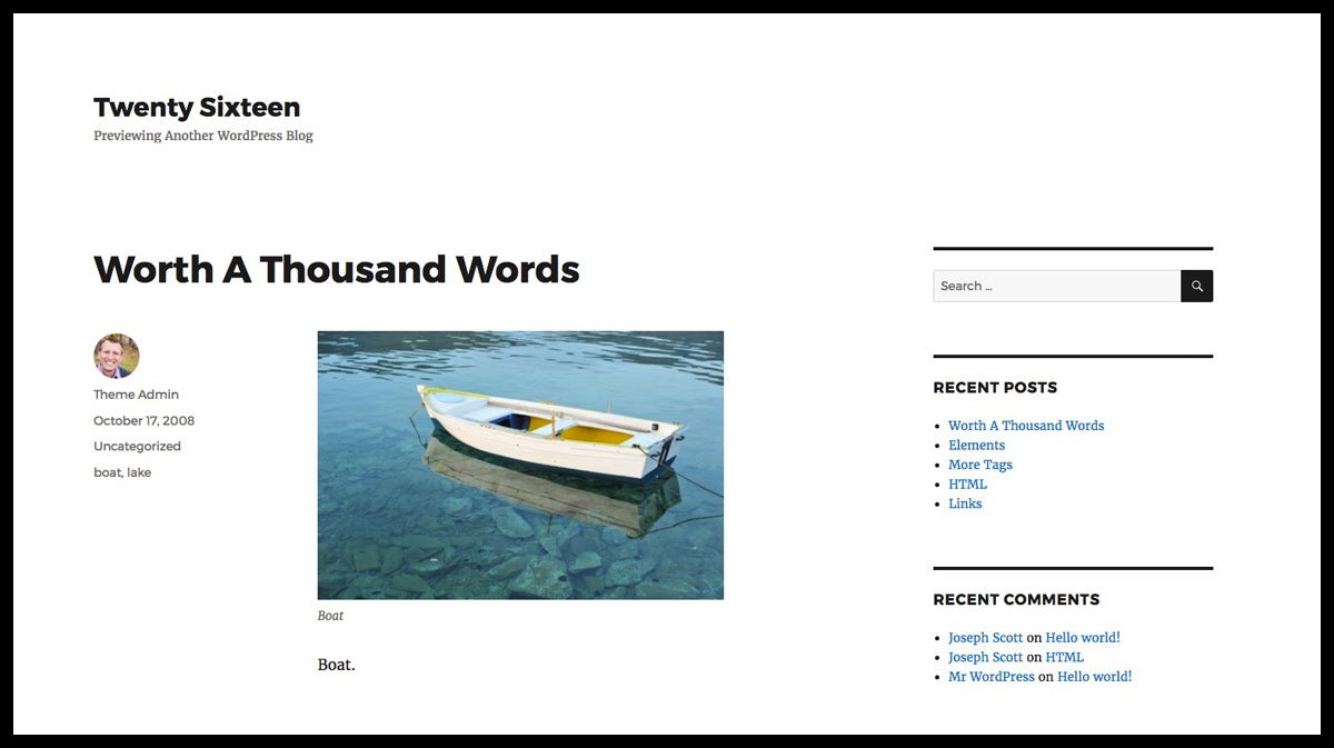
Title
Nothing fancy or unusual about the page/post title. It’s displayed in a bold font across the top of the page.
Excerpt
Not many themes use the excerpt on the individual article page, but Twenty Sixteen does a beautiful job of this. Displayed in the serifed font Merriweather, the post excerpt is fairly large in size, closer to the size of the title vs. the main body text. Set off in grey, it’s clear this is a sub-title of sorts.
Featured Image
Twenty Sixteen is smart when it comes to featured images. It supports up to a 1200px wide image when no sidebar is present, or 840px wide with a sidebar. The image appears just above the start of the content. And it looks equally as beautiful without any image at all. It was previously reported that it only used 150x150px square thumbnails as the featured image. This was my mistake.
Author, Avatar, Date, Categories, Tags
 All of this information is neatly tucked away in a left sidebar, set off from the main content. No icons; no bells & whistles; just the information. And everything is linked up to it’s appropriate author and taxonomy page. The avatar is displayed as a 49x49px circle.
It’s worth noting that once the screen drops below 1000px, this meta info is moved below the content—a nice touch that enables users to begin reading content immediately.
Main Content Area
The main contents of each article are rather narrow, on large screens only taking up about 600px of space. I’m a big fan of keeping line lengths short, as most people agree that between 45-75 characters per line provides the optimal reading experience.
Comments
Post comments are displayed immediately following the main content, in the form of: “4 thoughts on {post_title}”. As with many themes, Twenty Sixteen displays the commenter’s avatar, name (which links to website, if provided), date of comment (permalink), and the comment itself. Nested comments are also supported for replies, at least 1 level deep.
Previous / Next Post Links
This navigation is included in text-only form (no images). I like how, even on larger screens, they let each post occupy an entire horizontal line. Most post titles are long enough to warrant that much space, and Twenty Sixteen accommodated for it in its design.

Static Page Content
Static pages are designed very similarly to post content, but with the obvious information (meta data, prev/next links, excerpt) removed. Nothing special here, and as previously noted, no additional page templates to customize your static content.
Sidebars & Widgets
Twenty Sixteen sports 3 widgetized sidebars:
- right sidebar
- below content, left
- below content, right
The right sidebar is displayed alongside the main content, and bumped down below the content on smaller devices. The two “below content” widget areas appear after the comments (just below the footer). They are side-by-side on large screens and stacked on smaller screens.
Twenty Sixteen’s Responsive Layout
Twenty Sixteen includes a 100%, completely responsive layout, designed for optimal viewing on any device. The author paid special attention to every piece of content, moving things around based on how users interact with content on varying screen sizes.
- Menus become collapsible, but still very functional
- Social media links are repositioned
- Post meta information is downplayed in favor of the actual content
- Font sizes are adjusted beautifully
- Columns are restructured, or removed completely, as needed
Theme Options
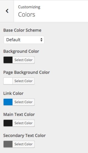
Twenty Sixteen uses the WordPress Customizer to control theme options. There are 3 main customization options in the Customizer:
Color
- Base Color Scheme: Choose from 4 pre-defined color schemes
- Background Color: Appears as a border around all content
- Page Background Color: The container where all content is located
- Link Color: The color for all your links, which includes the
:hovercolor for top navigation items - Main Text Color: Most of your main body copy will appear this color
- Secondary Text Color: Used for blockquotes, as well as the general
:hoverstyle for most links
Header Image
- Adds the ability to upload a custom header image, to be displayed at the top of every page. Supports multiple images which you can randomize.
Background Image
- Adds the ability to upload a custom background image, instead of using a color. Supports tiling, as well as horizontal & vertical repeat.